Average sea level rise: abrupt increase of over 20 centimeters in less than 150 years and even worse future estimates.

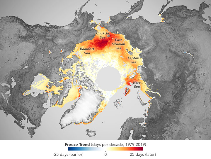
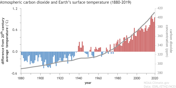
The trend of global sea level rise has more than doubled from 1.4mm per year for most of the 20th century to 3.6mm per year in recent years at an ever-increasing rate.

The global mean sea level has risen by about 21–24 centimeters since 1880, of which about a third in just the last two and a half decades, increasing from 1.4 millimeters per year for most of the twentieth century to 3.6 millimeters. / year during the period 2006-2015. From 1993, the year of the start of satellite surveys, to 2020, the increase was about 9 centimeters, of which 1 only in the last 3 years, however in some ocean basins, this level has increased up to 15-20 centimeters in just thirty ‘ years. Overall, the different rates of past and future sea rise at specific points on earth may be higher or lower than the global average due to local factors including soil settling, coastal erosion, natural variability in the strength of winds and ocean currents. and the phenomenon of isostasia (rising of the mainland) still in progress due to the melting of the polar caps in the last glacial period. The effect of the latter phenomenon is still observable in the Scandinavian area where in the last 50 years there have been phenomena of sea level decrease of more than 20 centimeters while as many have been gained in different parts of Europe.

Continue Reading

North Atlantic Oscillation (NAO)

Brief explanation of this climatic index and its impact on the North Atlantic

The North Atlantic Oscillation (NAO) is a typical atmospheric mode of North Atlantic Region, with a dominant influence on weather and climate fluctuation over the ocean and adjacent continents (Appenzeller et al., 1998; Visbeck et al., 2001; Hurrell & Deser, 2010). It represents the “seasaw” of the atmospheric surface pressure fluctuation between the Azores and Iceland (Hurrell et al., 2003; Hanna et al., 2015), positive (negative) when both the semi-permanent low pressure over Iceland (Icelandic Low) and high pressure over Azores are simultaneously strong (weak) (Hurrell, 1995a; Serreze et al., 1997; Hurrell et al., 2003).

Continue Reading

The Earth’s cryosphere lost an area comparable to the United Kingdom between 1994 and 2017

The rate of melting has exceeded estimates of worst-case scenarios assumed by climate models and by 2100 the sea level will rise by one meter if we do not act

Between 1994 and 2017, our planet lost over 28 trillion tons of ice at an increasingly rapid rate. This is the result published on this paper (link) achieved by a team of scientists from the School of Earth Sciences and the University of Leeds coordinated by Professor Thomas Slater who collaborated closely with colleagues from the School of Geological Sciences of the University of Edinburgh, of the Mullard Space Science Laboratory at University College London and Earthwave Ltd.

Continue Reading

Dynamic Mapping of COVID-19 Infections

Here’s my dynamic map using time series data of Coronavirus infections around the world with the support of GeoPandas and Pandas Python libraries. The time series data are acquired from the 2019 Novel Coronavirus COVID-19 (2019-nCoV) Data Repository by Johns Hopkins CSSE. Below the .GIF image (click on it to enlarge) and the link to the Python code written to produce this map.

Greenland Surface Mass Balance (Spatial Behaviour)

In this article the spatial distribution of changes in Surface Mass Balance (SMB) coming from Model Atmospherique Regional (MAR) will be shown and discussed. Figure shows (a) the average for 1958-1990 and (b) the difference between 1991-2016 and 1958-1990 SMB. In these maps, mass flux is expressed in Kg/meters squared*year, equivalent to mm w.e./year. Figure (a) shows the mean SMB for the period 1958-1990 whereas, figure (b) shows the difference between the average of two periods (1991-2016 minus 1958-1990). In figure (b), hatched areas indicate differences that are significant at 95% level of a two tailed t-test applied on each pixel. Overall, Figure (a) shows a relative wide belt of ablation zone in the southwest/west in contrast with a narrow ablation zone in the steeper-sloped and higher south-east. The difference in SMB between the two periods analysed (Fig b) shows two different and opposite behaviourwith a strong decrease along the ablation zone and the lower part of accumulation zone whereas, a slightly increase in the interior.